Hand drawn wireframes
After several sketches, this concept felt familiar and friendly.

Project case study
Crafting an experience that is intuitive, beautiful, and engaging to empower users to feel creative and surround themselves with unique floral arrangements.
This app is a work in progress. This project shows the second iteration of a design concept. Read on to learn the story!

Showcase handcrafted bespoke floral arrangements and empower users to feel creative with options to create their own one-of-a-kind floral arrangement.
Exploring subscription and one-time purchase models, while integrating lifestyle content to enhance user engagement.
The challenge: Balancing aesthetics with a delightful user experience.
Timeframe
2 months
My role
Research, visual design, UI/UX design, user testing
Platforms
iOS, Android
Tools
Figma, Photoshop
The research helped navigate design decisions to create a user-centered design. The research involved crafting detailed user personas, mapping their journey, nurturing creativity through flow and unveiling user desires through interviews. User surveys provided a deeper understanding of user desires to feel a creative spark and became the guiding light for all design decisions.
The in-depth user persona revealed Sarah, a busy professional who values creativity and personalization. She seeks to have a meaningful life and establish interesting connections and experiences.

The user flow diagrammed the interactions, ensuring a clear and efficient path for Sarah to achieve her goals. Taking took into account that Sarah is a busy professional, all the creative customizing options were placed on one screen which made Sarah feel empowered to harness her creative spark in the most opportune time during the flow.

The user journey mapped her steps, from browsing for inspiration to customizing her perfect arrangement and scheduling delivery. Each touchpoint was examined to ensure a delightful and intuitive experience.

The feedback allowed me to refine the app's design, ensuring it resonated with users. The central design challenge focused on balancing user empowerment in customizing arrangements with minimizing the number of clicks required for customization and purchase.

From hand drawn sketches to refined low fidelity wireframes.
Initial user feedback from interviews and surveys identified areas of improvement.
User feedback from interviews and surveys improved usability issues and refined the layout, navigation and interaction flow.

Usability testing led to implementing of user feedback, including refinement of the visual design.
It also revealed key themes in functional needs and desires from users.
Read below to see the iterative process.
User research identified key themes in desired features that would enhance user satisfaction. See the iterative process of implementing user feedback below.

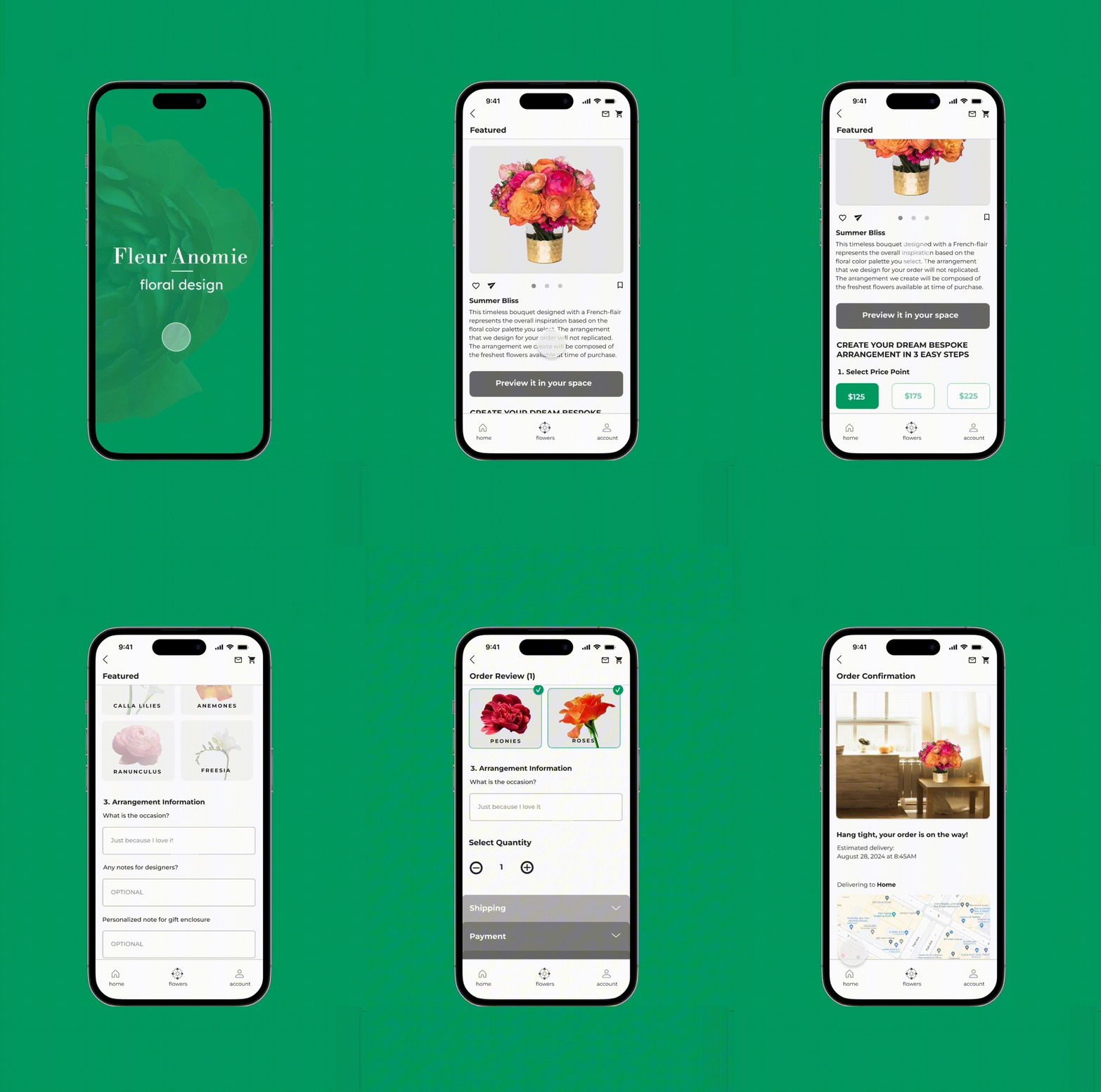
All complete screens of app

Prototype connections

The three biggest lessons I've learned during this project so far are:
1.) How important it is to test early and often in order to learn what works and what can be improved.
2.) Gathering insights from multiple users and sources during research.
3.) The power of user testing gives more holistic feedback about what to build.
Continue testing the design to learn what improves the experience, improves retention, and increases purchases.
Continue finding other ways to make deeper connections and keep the users engaged.
Produce a dark version of the app.